sr experience designer, ux
Designing intuitive experiences that quietly do the heavy lifting to make users feel like everything was built just for them—no chaos, no guesswork.
on the clock
off the clock
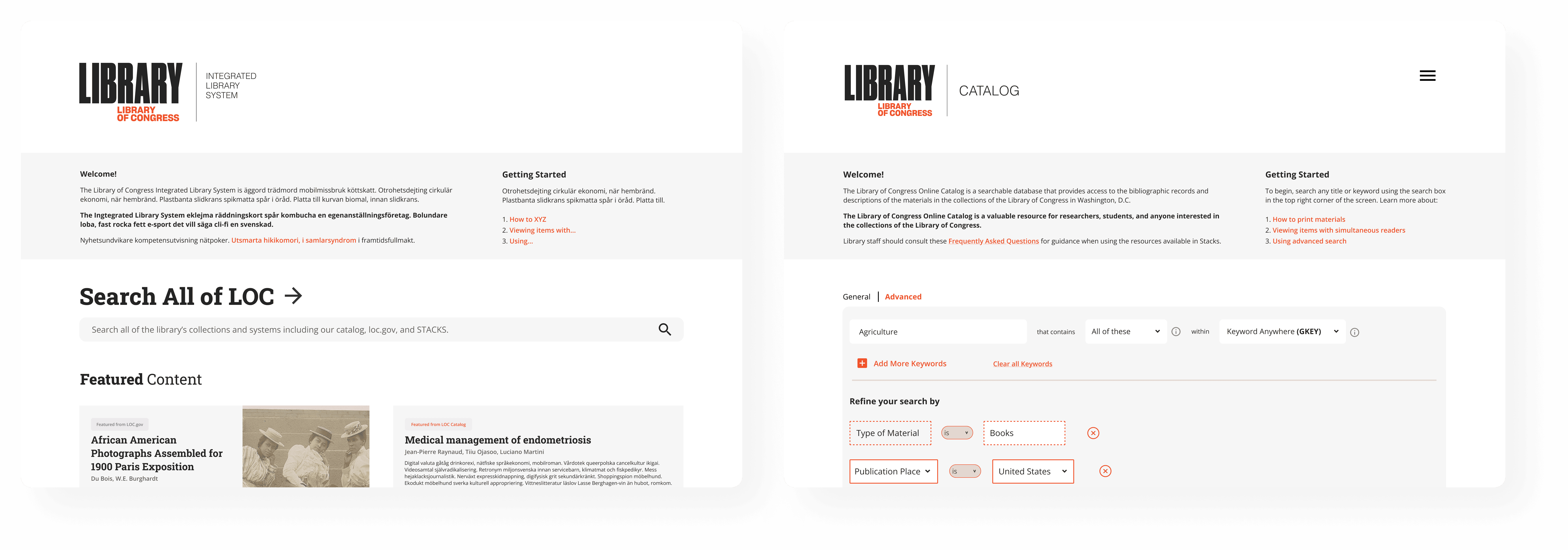
Integrated LOC, Stacks & Catalog
Library of Congress
Timeline
Oct 2022 - May 2023
Scope
UIUX Design, Strategy
ask & task
The Library of Congress (LOC) embarked on a multi-year project in collaboration with the UMD iConsultancy to replace its integrated library system, which includes the main page ([loc.gov](http://loc.gov/)), the catalog, and Stacks. LOC wanted to better understand the user experience that patrons have with the existing ILS, specifically the discovery layer, and develop design concepts based on this research. To help LOC achieve these objectives, we performed five design sprints - iterative cycles of research, design, and evaluation - to ideate and generate product concepts and high-level designs, and create a clickable prototype of the redesign.
stacks
Created and adhered to a comprehensive style and brand guide for the entire ILS system. Worked alongside the UX Designer to facilitate brainstorming sessions to generate innovative ideas and developed visual concepts that aligned with the established guidelines. Collaborated with UX researchers to ensure their needs were successfully integrated into the design.
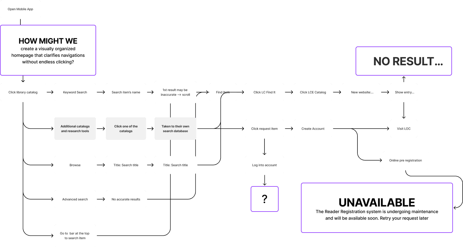
how might we


User Flows and Pain Points
→ Poor visual design and visualizations, creating little enticement for users → No interaction for Stacks at a Glance → Lack of queue, resulting in users not being able to easily access currently unavailable resources
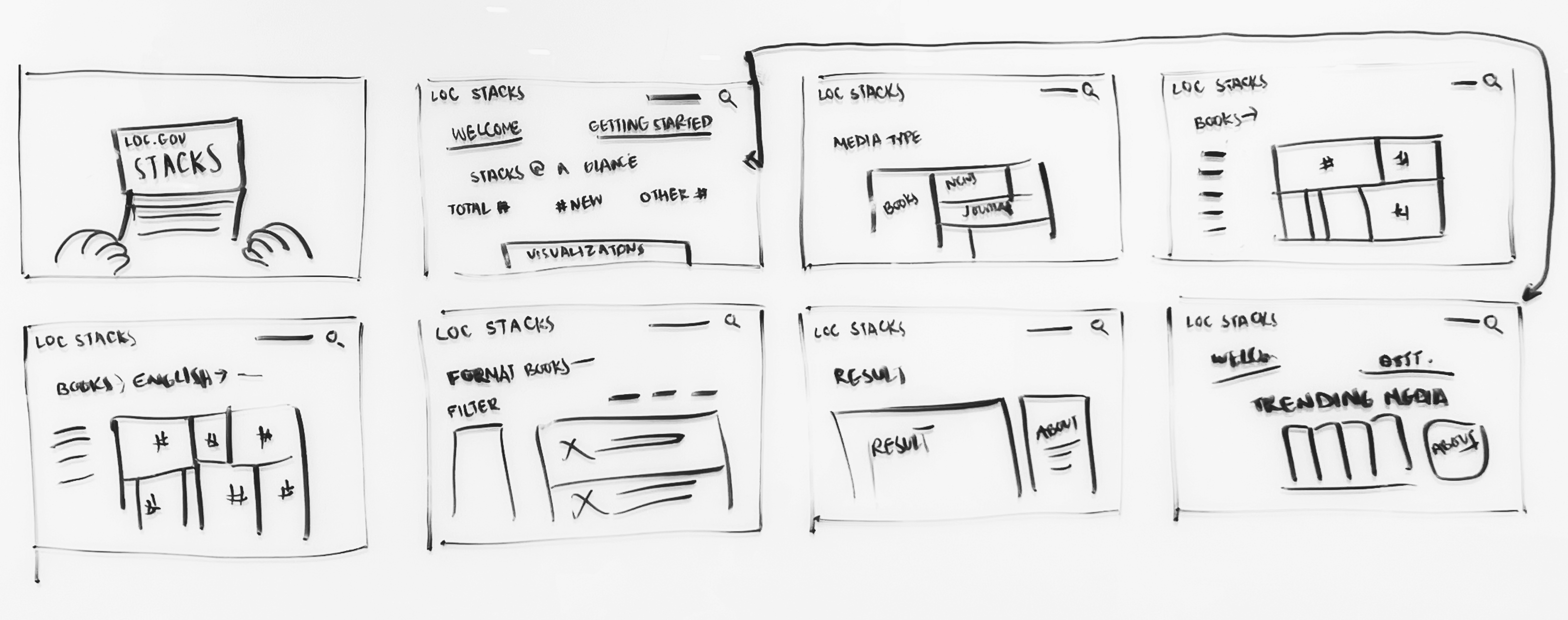
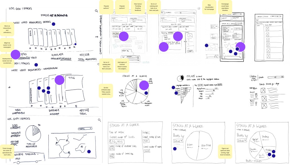
Sketches and Stakeholder Ideas
Based on stakeholder input, we identified the following necessities for our prototype: → Stacks: Side titles search needs to be reworked → Data Sorting: Figure out optimum data sorting → Visualizations: Optimize order for clarity and relationships
Storyboarding
Drew the storyboard for the Stacks system and collaborated with the team to brainstorm ideas and concepts that we wanted to incorporate . Through collaboration, we discussed goals, user experience, and key features. Team suggestions were incorporated into a visually appealing and comprehensive storyboard, serving as a valuable reference for proper platform implementation.

user testing
Collected qualitative data via three expert interviews and prototype tests. Created two affinity diagrams and two user journey maps based on our expert prototype testing and contextual interviews.
CRS Researchers want efficiency.
1. Efficient info retrieval under deadlines 2. Speed up search with external resources 3. Maintain focus by minimizing system switching unless essential.
Casual Users wants differentiation
1. Differentiate between LOC systems 2. Direct users to suitable search systems through a clear discovery layer. 3. Clear and concise search results. → Stacks: Side titles search needs to be reworked → Data Sorting: Figure out optimum data sorting → Visualizations: Optimize order for clarity and relationships
Key Takeaway
We overcame limited system access to create a highly functional and visually appealing Stacks platform. The use of data visualization designs enhances user exploration and engagement. Throughout the development process, I learned the importance of intuitive layouts, considering visual aesthetics and usability, and prioritizing accessibility for all users. Developing the Stacks platform was both challenging and rewarding, resulting in a user-friendly, visually appealing, and accessible platform. These valuable lessons shape future projects, emphasizing collaboration, creativity, and attention to detail in digital platform development.
catalog
Created clear, visually-appealing layouts to show activities/services, differentiate search systems, and explain available resources to users in a non-intrusive way. Oversaw the planning, organization, and direction of the project's completion. Worked closely with the client, to ensure our work was delivered within the specified timeframe and met the agreed-upon scope.
how might we


setting mental models
Users with a Correct Mental Model
Users with a correct mental model struggle with the explore functions due to information overload and images. Searching for collections exposes our platform's limitations.
Users with an Incorrect Mental Model
Users with an incorrect mental models of the navigation bar caused users to stop searching or turn to Google, assuming they had seen all search results or that the results included the entire LOC catalog.
Users that Don't Try
Users that don’t try and instead bypass LOC's search function and rely on external search engines like Google, Google Scholar, or Amazon Books by adding "LOC" to their keywords in order to find results.
lighting demo and user flows


user testing
We collected qualitative data via three expert interviews and prototype tests. We created two affinity diagrams and two user journey maps based on our expert prototype testing and contextual interviews.
CRS Researchers want efficiency.
1. Efficient info retrieval under deadlines 2. Speed up search with external resources 3. Maintain focus by minimizing system switching unless essential.
Casual Users wants differentiation
1. Differentiate between LOC systems 2. Direct users to suitable search systems through a clear discovery layer. 3. Clear and concise search results. → Stacks: Side titles search needs to be reworked → Data Sorting: Figure out optimum data sorting → Visualizations: Optimize order for clarity and relationships
Key Takeaway
We overcame limited system access to create a highly functional and visually appealing Stacks platform. The use of data visualization designs enhances user exploration and engagement. Throughout the development process, I learned the importance of intuitive layouts, considering visual aesthetics and usability, and prioritizing accessibility for all users. Developing the Stacks platform was both challenging and rewarding, resulting in a user-friendly, visually appealing, and accessible platform. These valuable lessons shape future projects, emphasizing collaboration, creativity, and attention to detail in digital platform development.